Lesson: Responsive Design with Bootstrap
Use the Bootstrap Grid to Put Elements Side By Side
Bootstrap uses a responsive grid system, which makes it easy to put elements into rows and specify each element's relative width. Most of Bootstrap's classes can be applied to a div element.
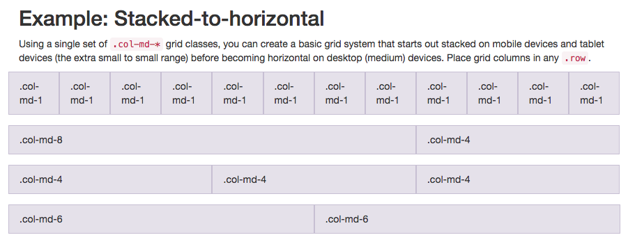
Here's a diagram of how Bootstrap's 12-column grid layout works:
Note that in this illustration, the col-md-* class is being used. Here, md means medium, and * is a number specifying how many columns wide the element should be. In this case, the column width of an element on a medium-sized screen, such as a laptop, is being specified.
In the Cat Photo App that we're building, we'll use col-xs-*, where xs means extra small (like an extra-small mobile phone screen), and * is the number of columns specifying how many columns wide the element should be.
Put the Like, Info and Delete buttons side-by-side by nesting all three of them within one <div class="row"> element, then each of them within a <div class="col-xs-4"> element.
The row class is applied to a div, and the buttons themselves can be nested within it.
The content on this page is licensed under Attribution-ShareAlike 4.0 International. Original authors: freeCodeCamp, the content was modified.

