Lesson: Responsive Design with Bootstrap
Create a Custom Heading
We will make a simple heading for our Cat Photo App by putting the title and relaxing cat image in the same row.
Remember, Bootstrap uses a responsive grid system, which makes it easy to put elements into rows and specify each element's relative width. Most of Bootstrap's classes can be applied to a div element.
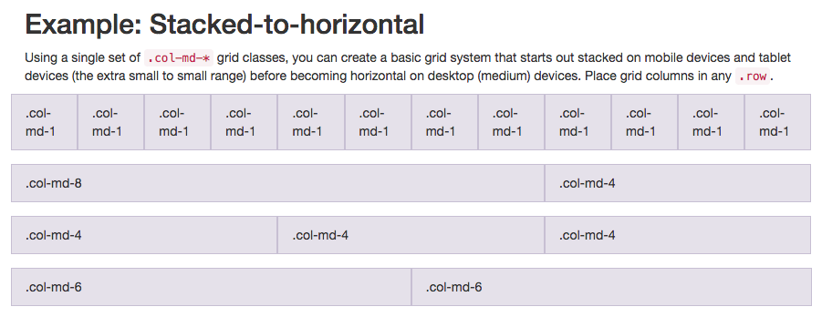
Here's a diagram of how Bootstrap's 12-column grid layout works:
Note that in this illustration, the col-md-* class is being used. Here, md means medium, and * is a number specifying how many columns wide the element should be. In this case, the column width of an element on a medium-sized screen, such as a laptop, is being specified.
In the Cat Photo App that we're building, we'll use col-xs-*, where xs means extra small (like an extra-small mobile phone screen), and * is the number of columns specifying how many columns wide the element should be.
Nest your first image and your h2 element within a single <div class="row"> element. Nest your h2 element within a <div class="col-xs-8"> and your image in a <div class="col-xs-4"> so that they are on the same line.
Notice how the image is now just the right size to fit along the text?
The content on this page is licensed under Attribution-ShareAlike 4.0 International. Original authors: freeCodeCamp, the content was modified.

